WRITTEN BY: SARAH DONALDSON – PROJECT MANAGER AND INTERN ARCHITECT
The clients for our Leaside Addition were desperate for more space as their young growing family was bursting at the seams of their existing two-storey semi-detached home. Instead of moving out of their neighbourhood and into a larger home, they wanted to take advantage of the depth of their property and build a rear addition. This smart urban infill allows the site to expand to its allowed density in an appropriate and respectful manner.

CONTEXTUAL ANALYSIS
As with every project, we start with an analysis of the site and surrounding neighbourhood. Due to the repetitive and horizontal nature of the existing streetscape we chose to maintain the front façade as is and bring our intervention to the rear.
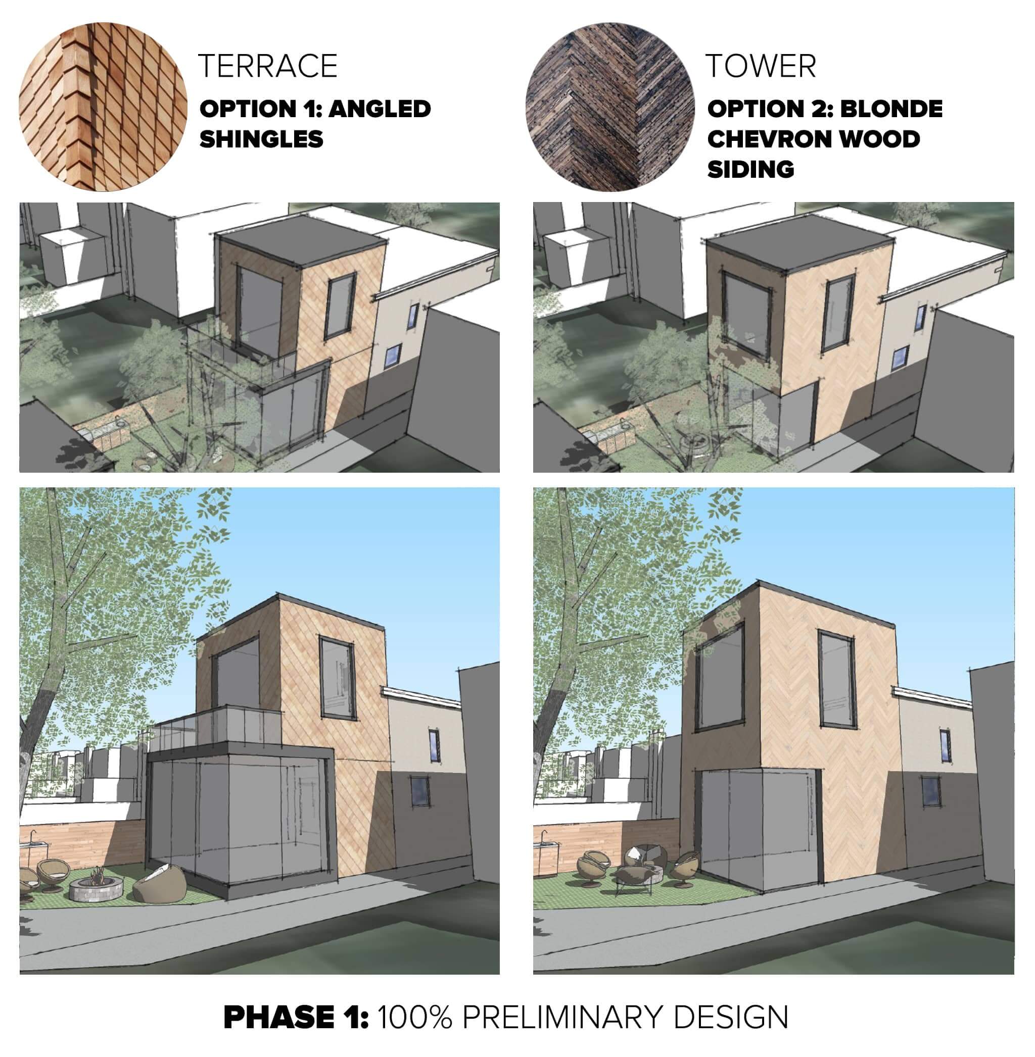
Here we proposed two options – a tower and a terrace. The terrace design employed a stepped approach which allowed for an elongated ground floor to house a generous open concept living space while providing a terrace off the master bedroom on the second. The tower design was quite opposite, instead of extending outwards it reached upwards. This allowed for the ground and second floors to gain equal floor area with emphasis on generous floor to ceiling heights. On the exterior a vertically oriented addition creates drama and contrast from the existing street fabric. Keeping the addition orthogonal allows both masses to tie cohesively together. The clients chose the tower design as they wanted to keep as much of their backyard area as possible while being practical on the interior programming.
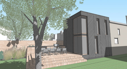
Parallel to studying the neighbourhood, we also studied the site’s solar patterns to optimize openings within the form. As the addition faces north, we have to be mindful not to design for too many openings as there would be very minimal gain. Our approach was if we could only carve a few openings they have to be dramatic and focused on the best views of the rear garden and neighbouring tree. The floor to ceiling corner windows on the ground and second floor do just that. Drawing your eye out towards the greenery and away from the neighbouring buildings.


EXTERIOR FINISHES
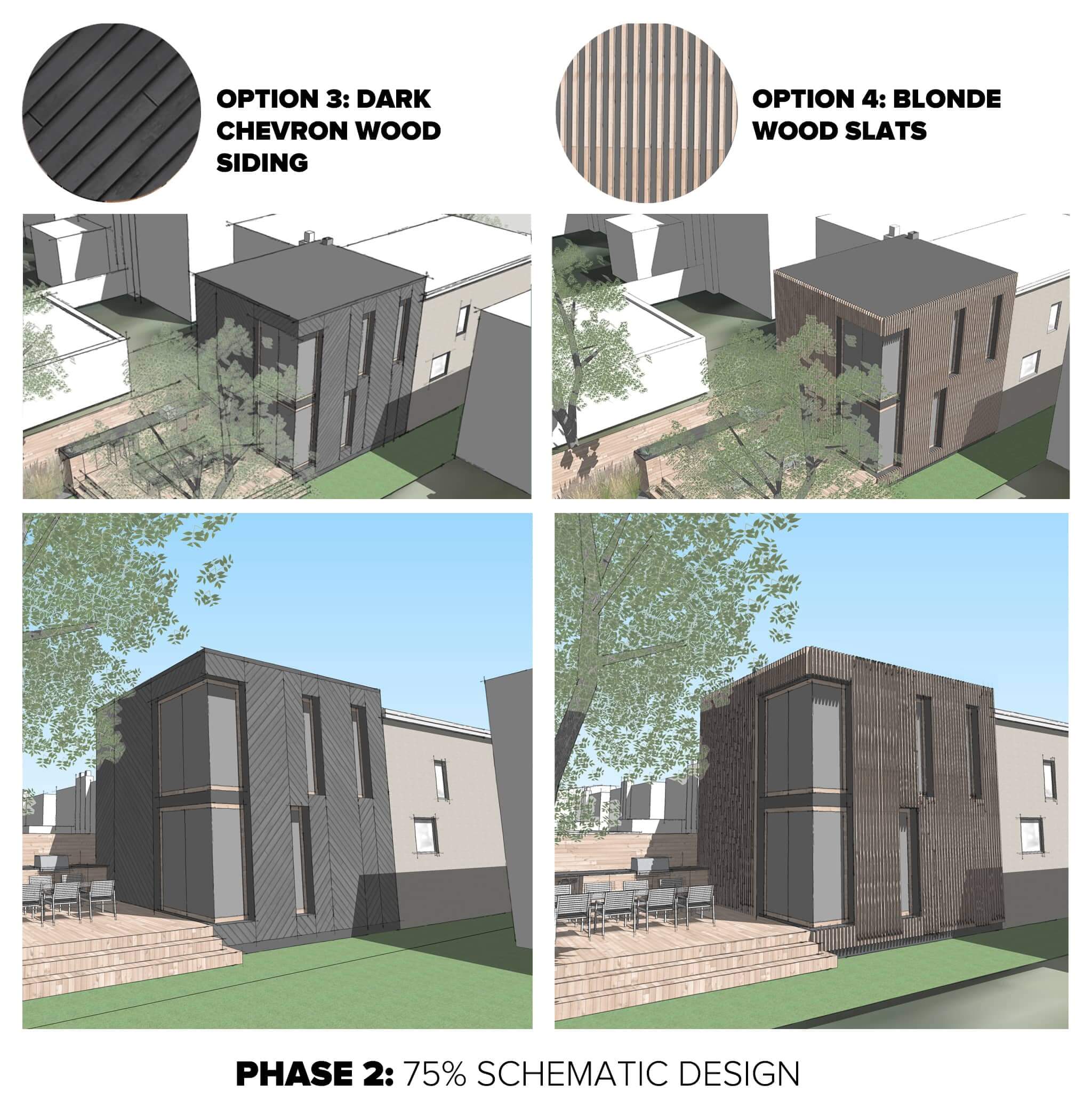
Once we locked in our building mass, we looked at what exterior cladding options would elevate the simplicity of the form. Our take away, BOXES DON’T HAVE TO BE BORING. Our clients requested simple, durable and low-maintenance materials. We presented two initial options; angled shingles and chevron patterned wood siding. Our goal was to use common everyday cladding materials in a completely different arrangement. Our clients selected a dark Maibec wood siding to be constructed in a chevron pattern. To elevate the pattern to the next level we used an irregular grid guided by the window openings to dictate when the pattern flips. We are working closely with the contractor to minimize waste and ease constructability.
NEXT STEPS
Building permits are in the works, and we are very enthusiastic to begin construction this summer. Follow progress on Facebook, Instagram, Twitter, and Houzz.

