THE GLOBE AND MAIL
DAVE LEBLANC
NOVEMBER 15, 2022
At some point in the 14th century, painters began toying with linear perspective, which created artificial depth. Combined with realistic depictions of light and shadow, portraits, in particular, seemed so three-dimensional that they practically popped off the canvas. And their eyes! No matter where a person stood in the room, those beady little orbs followed.
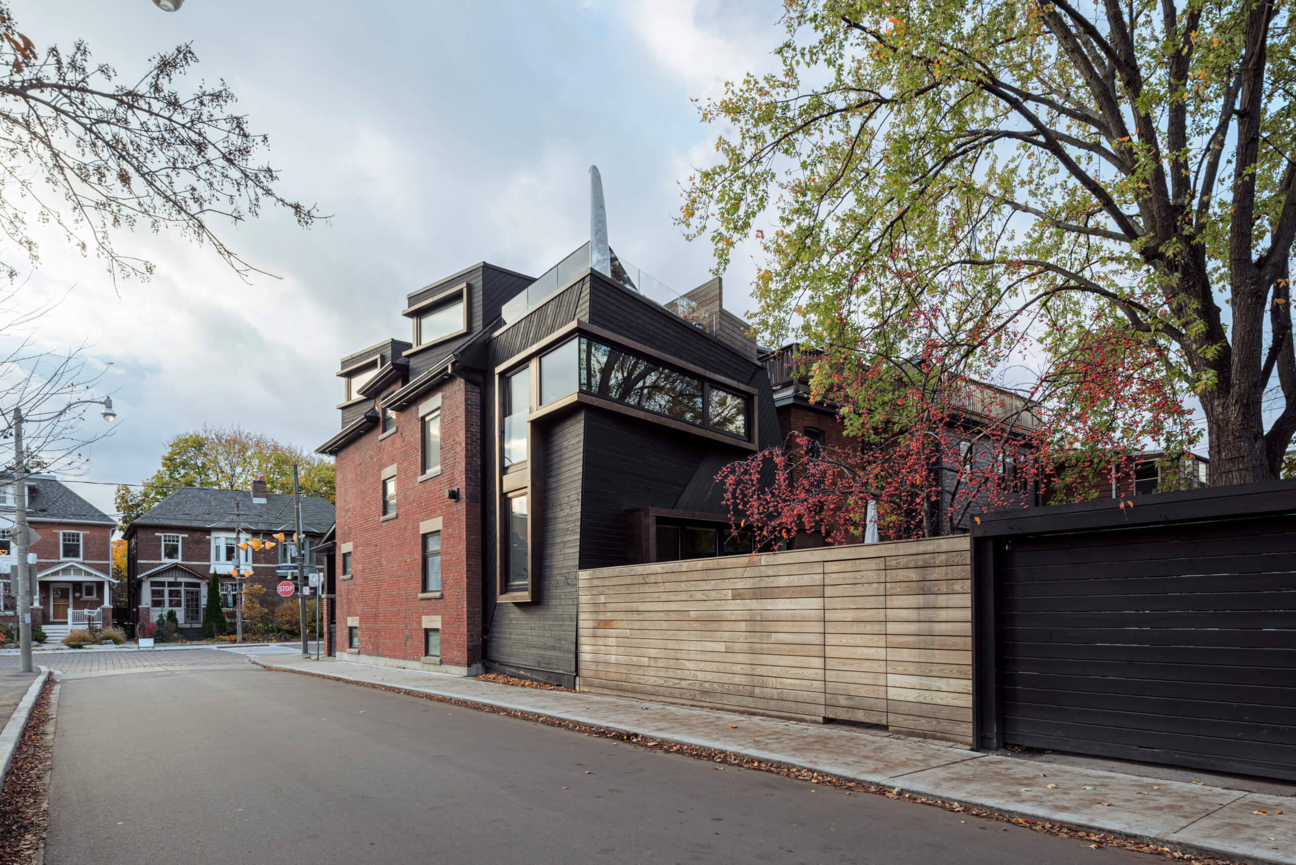
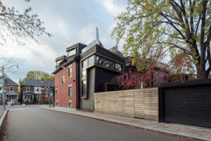
Architecture, of course, is a three-dimensional art. And a building’s windows have always been compared to eyes. Yet, on so many masonry faces those ‘eyes’ seem blank … and follow no one. Except, of course, if one happens to be walking or playing tennis in Withrow Park in Toronto’s Riverdale neighbourhood, where two dormer windows that belong to Alex Sharpe and family will win the staring contest every time.
“We wanted to orient [the windows] away from the main street and the other homes,” says Mr. Sharpe, who co-founded iQ Offices in 2012 and is currently developing Belleville, Ont.’s Black Bear Ridge golf course into a massive housing community. “We didn’t actually consider them as part of the original design, but I [said] ‘Look, if I’m going to go to this extent [with a renovation] it would be a silly thing not to consider.’”
But instead of coming off as creepy, these eyes/dormers – as penned by Mr. Sharpe’s long-time friend and architect Craig Race – come off as benevolent, as does the large, modern addition that’s now affixed to the rear of the stately 1912 house, which adds a proper 21st-century kitchen. That’s because Mr. Race’s design shows deference to the red brick home by tucking in to show where the old building once terminated, by being clad in black, and, finally, by leaning back to allow the neighbour to the north to receive the same amount of sunlight on their rooftop deck that they’ve always enjoyed.
But how to achieve all of that without looking like Daniel Libeskind’s clingy, heavy-handed addition to the Royal Ontario Museum?
“The ROM relies on very bold materials to stand out,” Mr. Race says. “We wanted to use modern, clean-lined claddings but with a texture and a tone that was more complimentary of the existing shingles and other components of the house so that it wasn’t, maybe, standing out quite as much, it wasn’t so loud.
“We angled the south wall just slightly so it leans away from the sidewalk,” he continues, “and the intention behind that was, obviously, to sacrifice interior space so we could have a more sensitive form … so as you walk past it’s not looming over you.”
Turn the corner and admire the front façade of the house, with its lemonade-worthy front porch, second-floor bay window and gabled roof, and one will instantly forget that any work has been done at all (in addition to the, um, addition, a great deal of structural reinforcement had to be done to the existing house).
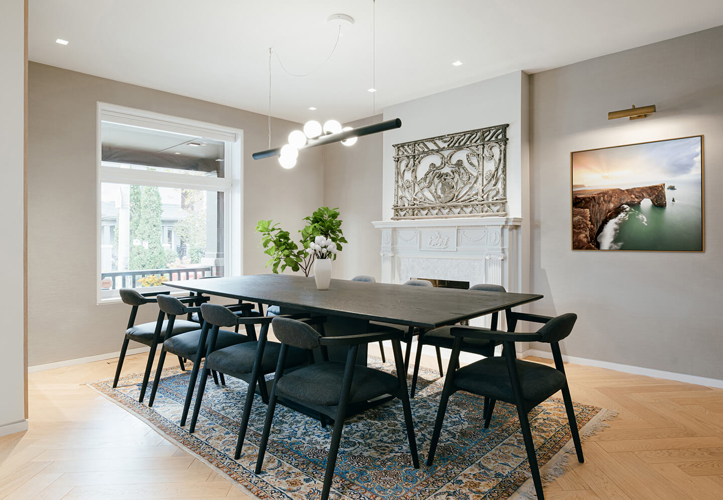
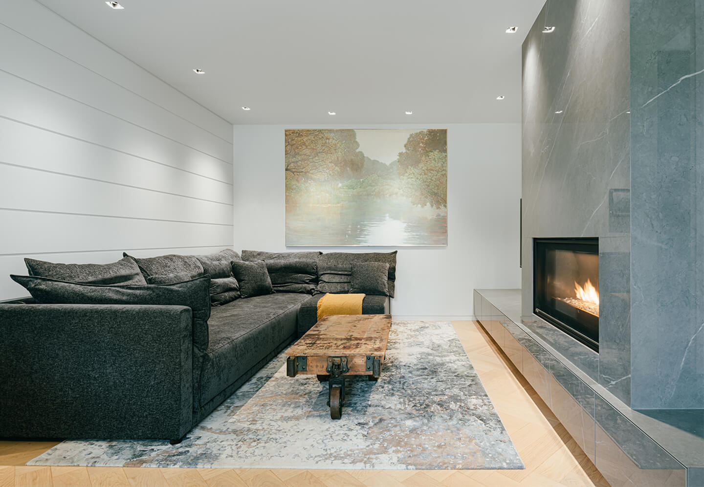
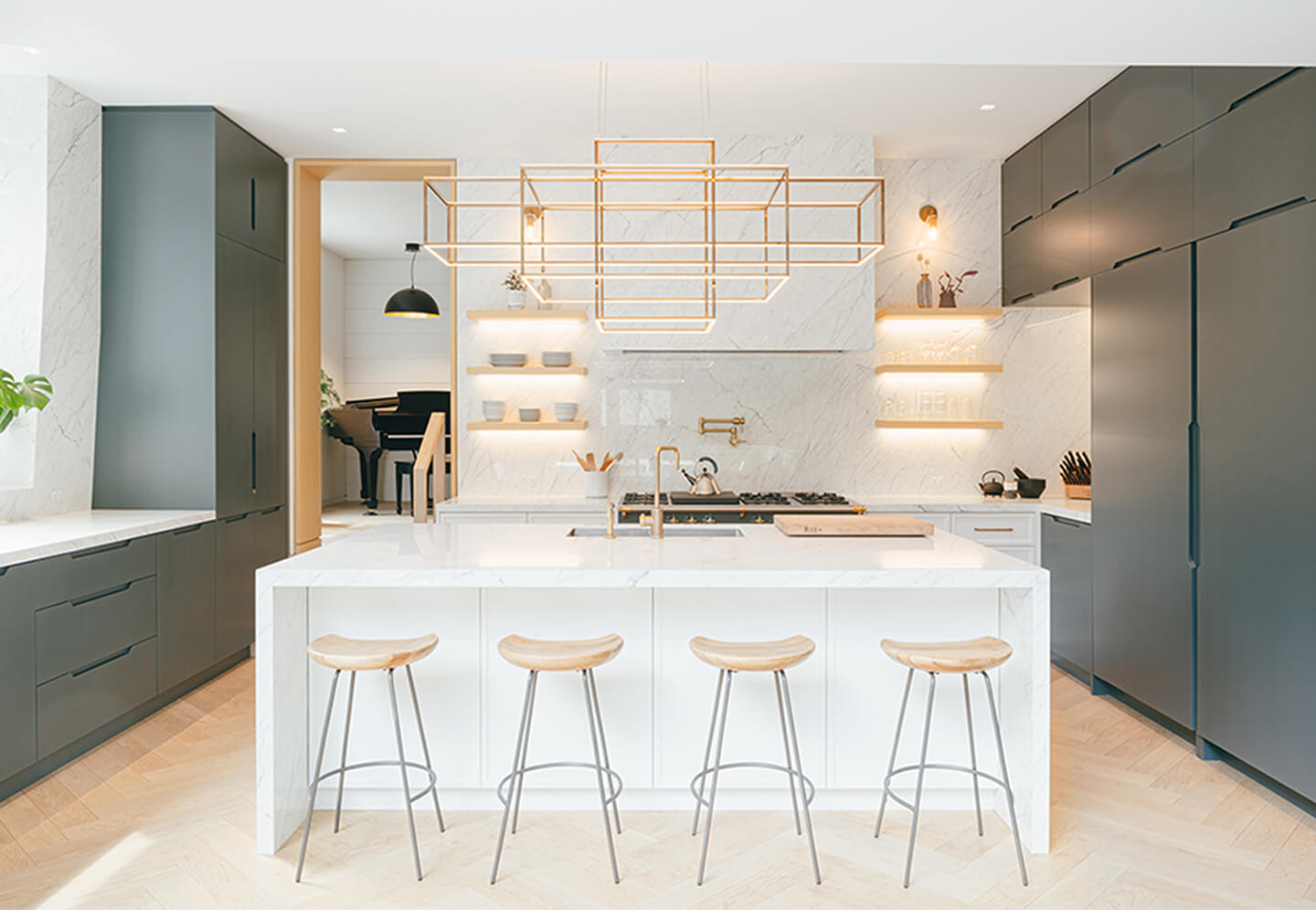
Similarly, trot up the steps and open the front door, and a visitor will admire the quaint and very Edwardian room that now serves as the formal dining room. It’s only as one moves toward the back of the house – past the living room, with its handsome shiplap panelling and nook created specifically for a piano – and to the new kitchen that the vibe and palette transitions from traditional to contemporary. Back here, it’s all cool veined marble, open shelves, and cabinets with brass pulls, with the dual punctuation marks of a cagey lighting fixture by Zac Ridgely and a massive Lacanche range.
And because the kitchen is a few steps down from the living room, it connects perfectly with the outdoor deck.
But why separate the dining room and kitchen? Just one of the quirks of owning an older house with non-open concept, says Mr. Sharpe, who is currently nursing a beer at the kitchen island: “That was actually the designer, Lauren Woods, she was encouraging of this setup partially because of the proportions of the room and where we wanted to put the powder room, but also she’s a mother with young kids … and it’s great to have an ear on what the kids are up to, right? At one point the design did actually have the dining room in here and the living room on the other side … but I’m quite happy with the outcome.”
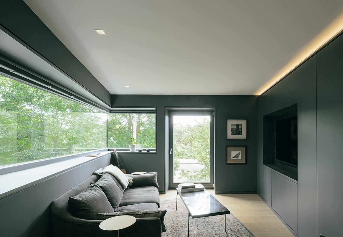
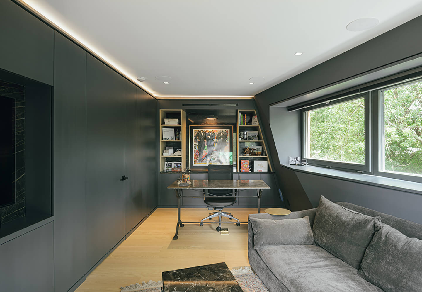
Mr. Sharpe is also happy with the origami-like folds on the one wall of his kitchen – caused by Mr. Race’s pushed in façade – and, upstairs, how similar folds combine with a long, copper-framed ribbon window to create a home office/command post worthy of a burgeoning real estate mogul. Painted battleship grey and with a door that disappears into the wall when it’s closed, it’s a “guy’s hangout” Mr. Sharpe says.
“You know, the kids are coming into it and they know it’s dad’s room,” he says with a laugh, making sure to point out the toys left in the corner.
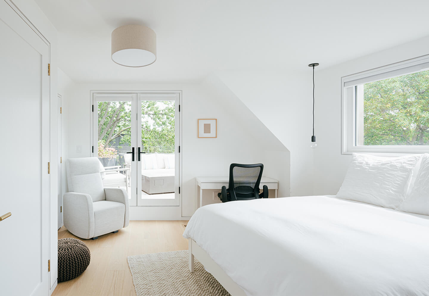
Speaking of his kids, one of them benefits from a light-filled bedroom on the third floor (thanks to the new dormer), while the other dormered room is given over to guests. The guestroom, it should be noted, connects to an in-the-trees deck complete with ample seating and a fire table to warm up cool November nights. Ten years from now, when his five-year-old and seven-year-old are in their teens, Mr. Sharpe fully expects the two will “flip and coin” to see who gets ownership of this little slice of heaven.
And with materials so durable and so expertly handled by Mr. Race (as well as the glorious millwork by Blue Shell Construction), in 10 years this house will look no different than it does today. And should the Sharpe teenagers even think of getting up to no good in the park, they’ll need only to look up at the lively, animated façade of the family abode to be reminded that someone, or something, is always watching.
LINK: https://www.theglobeandmail.com/real-estate/toronto/article-renovation-puts-eyes-on-the-park/
